NATIVE MOBILE PATIENT PORTAL APP
Empowering patients with self-service health tools
MY ROLE
User Research
User Persona Development
Information Architecture
Wireframing
UI Design
Usability Testing
Prototyping
Traditional medical records and results confuse patients and fail to adequately communicate critical health information. This results in patients feeling removed from their providers as well as increasing frustration with current portal offerings.
How can we empower patients to feel more in touch with their providers and health status?
To develop a deeper understanding of the target audience and their needs, a diverse group of active patient portal users were recruited for user research interviews.
Affinity mapping was used to identify patterns in the qualitative data, key insights of which are highlighted below:
Quotes
"I like being able to complete tasks on my own, at whatever time is convenient for me."
"Portals feel very administrative to me and I often feel removed from my actual provider."
"In the portal I use now, there are a bunch of buttons that don't work at all when I tap."
"I look at my test results and think: This isn't 'English enough' for me to understand."
Findings
Needs & Goals
24/7 access to self-service tools
Messaging feature
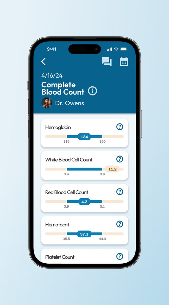
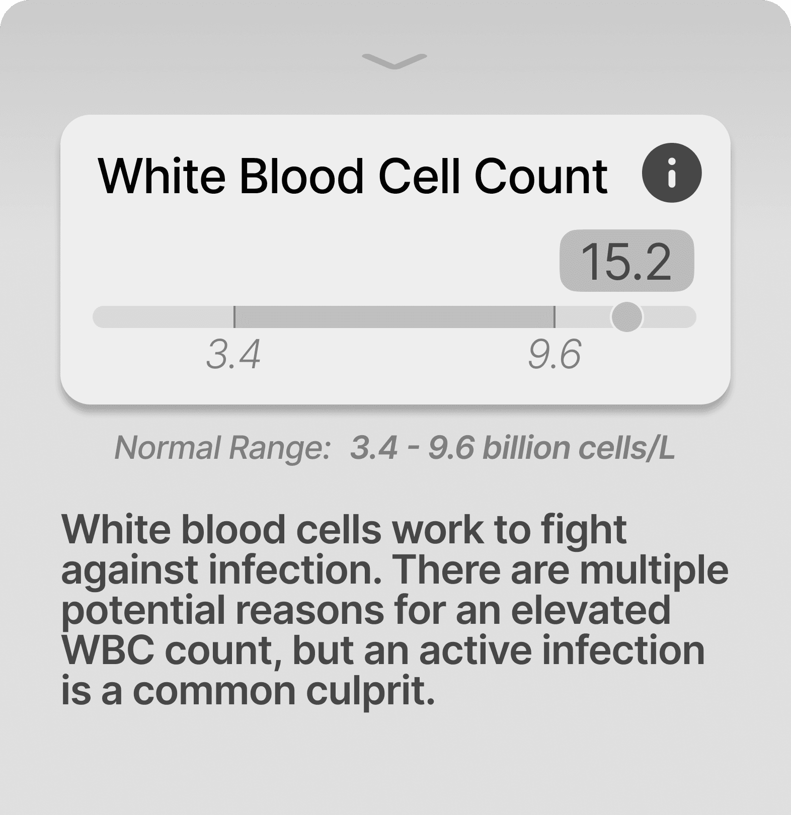
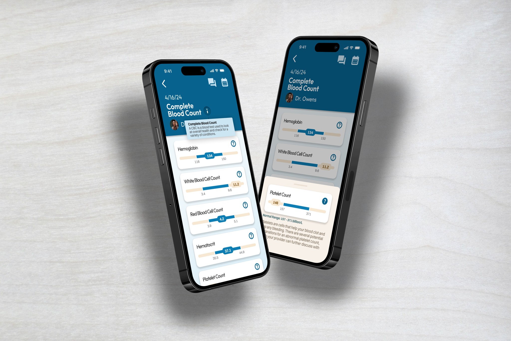
View test results & explanations
Make, modify, & cancel appointments
Behaviors & Attitudes
Usage frequency: 3x per month
Avoidance of mobile portal use due to poor responsive design
Appreciation for independent action
Frustrations
Cannot modify existing appointments
Confusing test results
Facts
No embedded educational content in portals currently used by participants
The data also exposed several user pain points:
Confusing medical jargon
Provider disconnect
Unreliable interfaces
Next, a problem statement was crafted to structure the subsequent design process:
Users need an approachable health portal that contains tailored educational resources and self-service tools because patients lack a consistent platform to adequately address their questions and concerns.
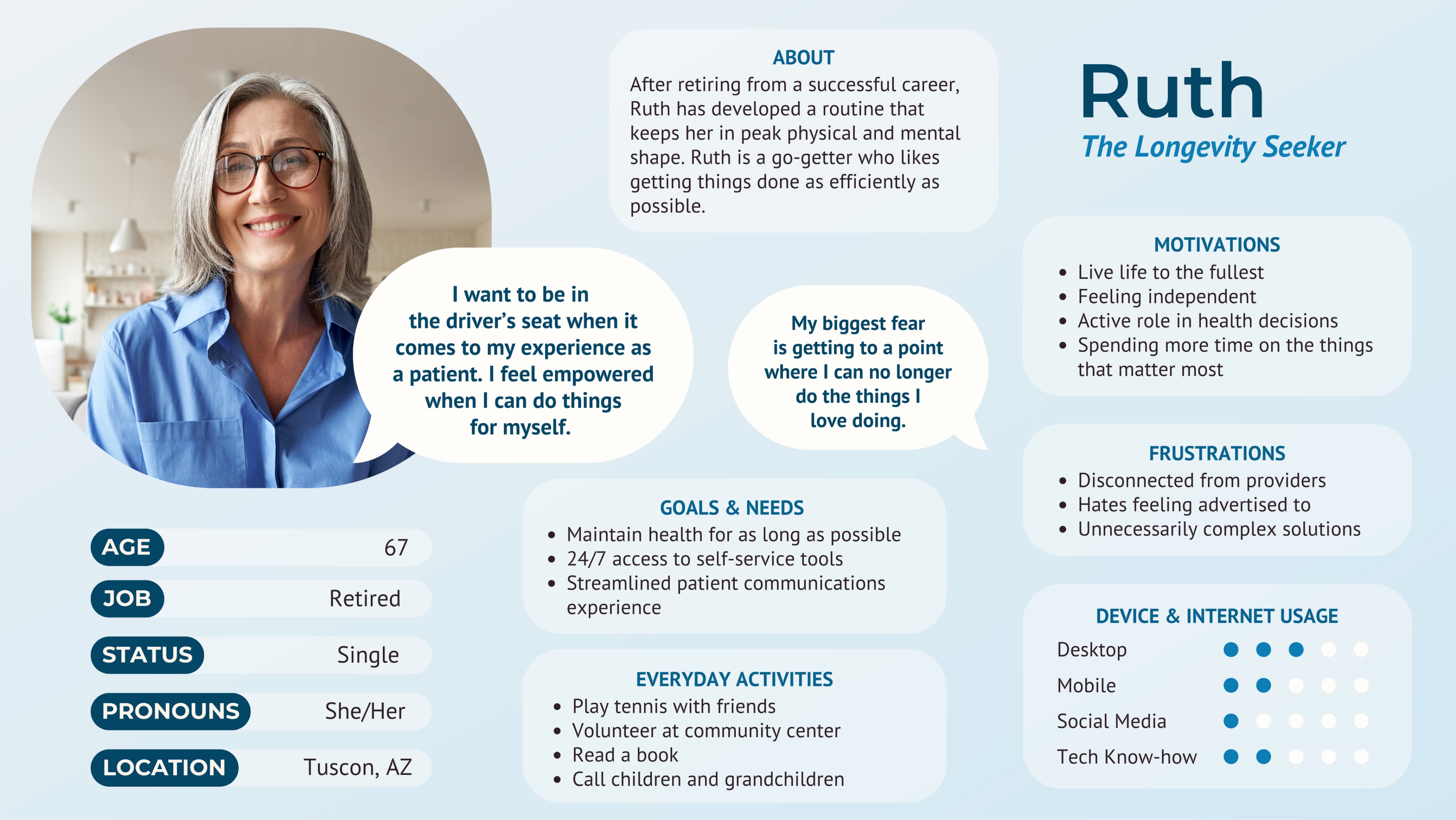
The wants, needs, and pain points discovered were all incorporated into user persona Ruth to etablish greater empathy for the primary target audience.
Ruth served as a critical reference point throughout the design process, ensuring that each feature and flow was designed with users' needs top of mind.
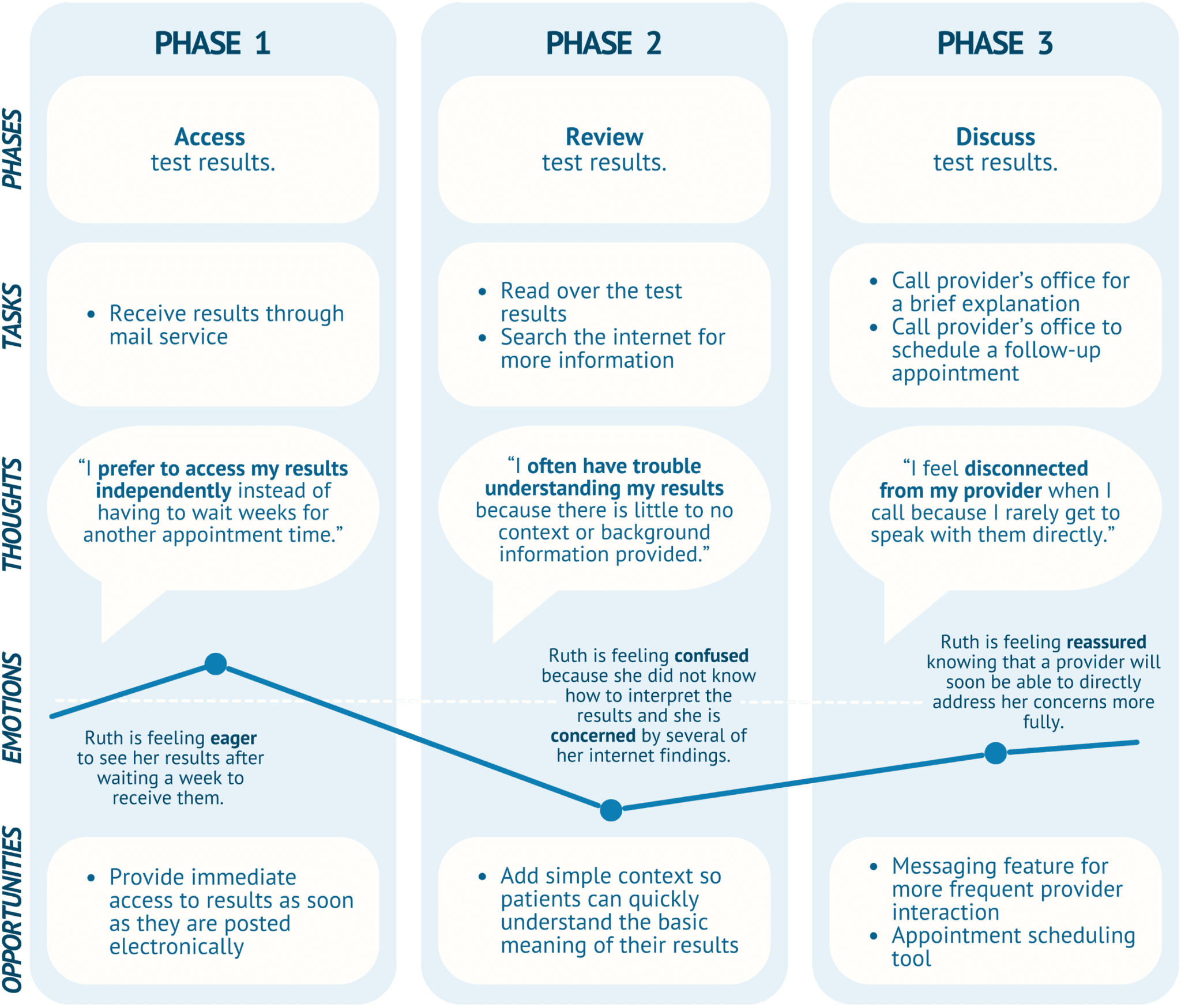
User journeys were outlined to visualize the steps Ruth would take to achieve her goals as a patient, revealing several UX opportunities.
Scenario:
Ruth recently had medical testing done with her primary care provider. She independently reviews the results, which leave her not only confused, but concerned. Ruth wants to reach out to her provider for clarification and to schedule a follow-up.
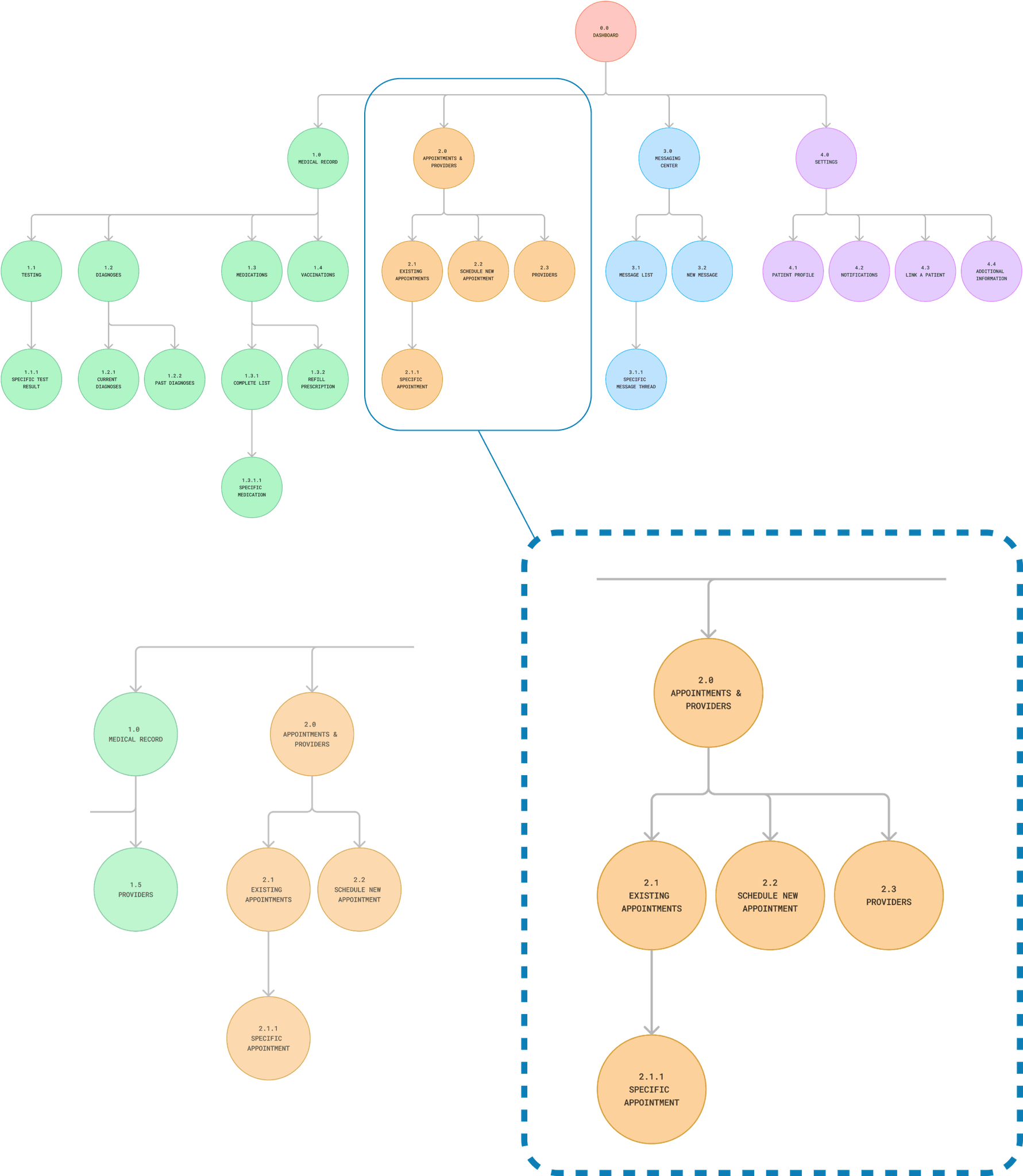
Primary screens deduced from user persona and flow documentation were incorporated into a sitemap.
Card sort testing was carried out to determine whether the proposed information architecture aligned well with the existing mental models of users.
Digital Open Card Sort
Why Digital?
Efficient, user-friendly testing
Expedited result analysis
Conducted using Optimal Workshop
Why Open?
Generated new ideas
Uncovered other perspectives
Critical feedback in early design stage
Results
Quantitative data revealed that providers and appointments were closely linked by users.
Action Taken
Provider and appointment-related sitemap components were combined into a single category to better align with users' expectations.
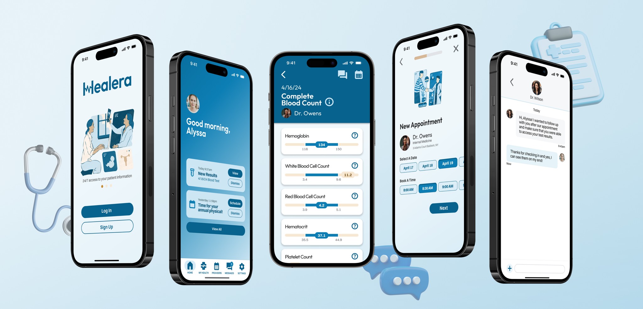
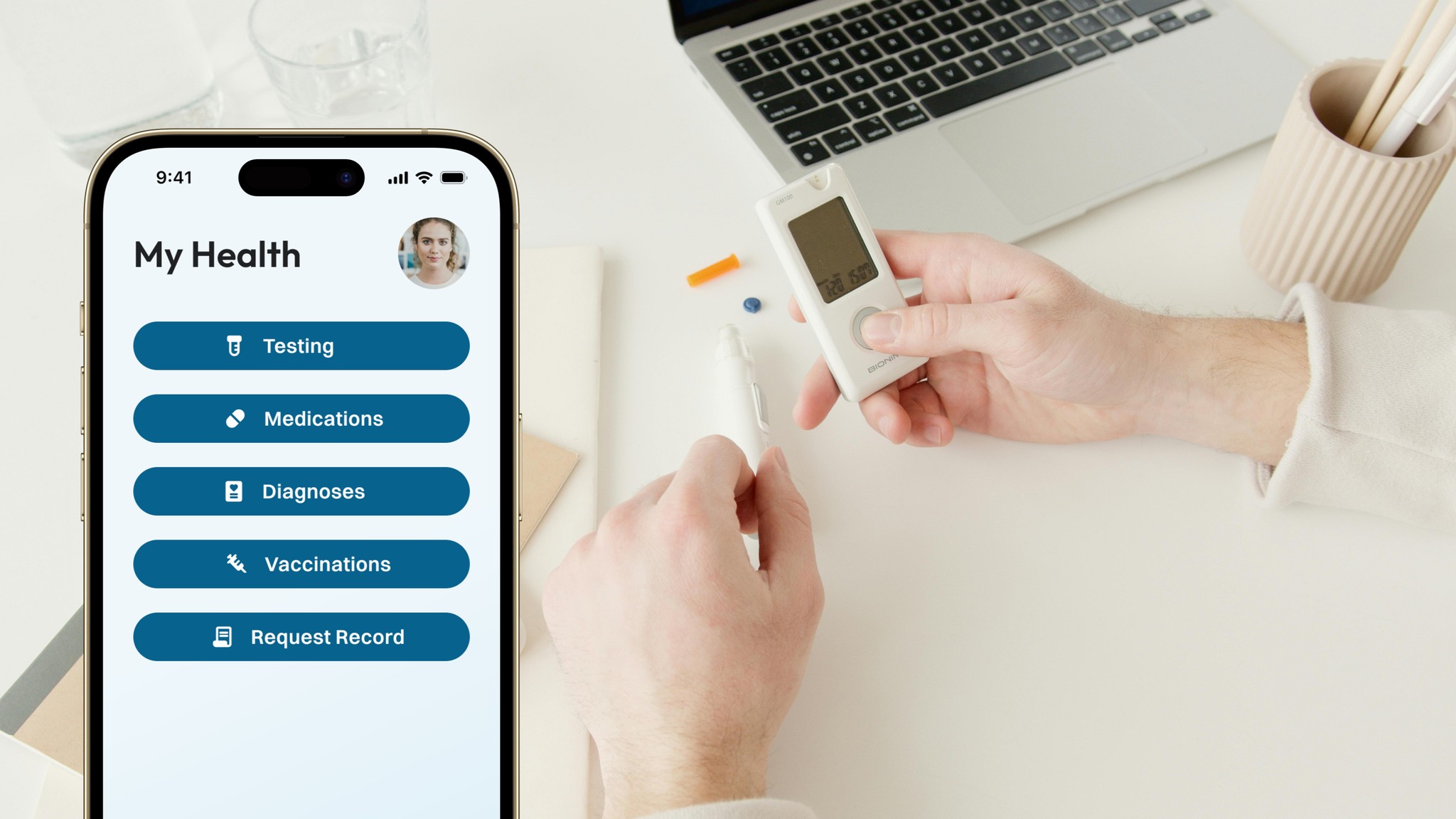
Based on information gathered in user research, three principle features were prioritized for this iteration of Healera:
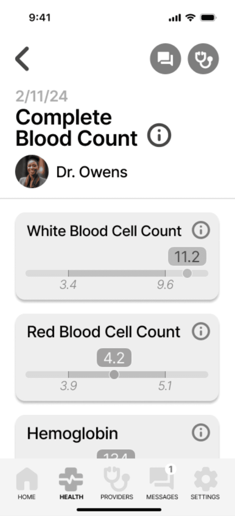
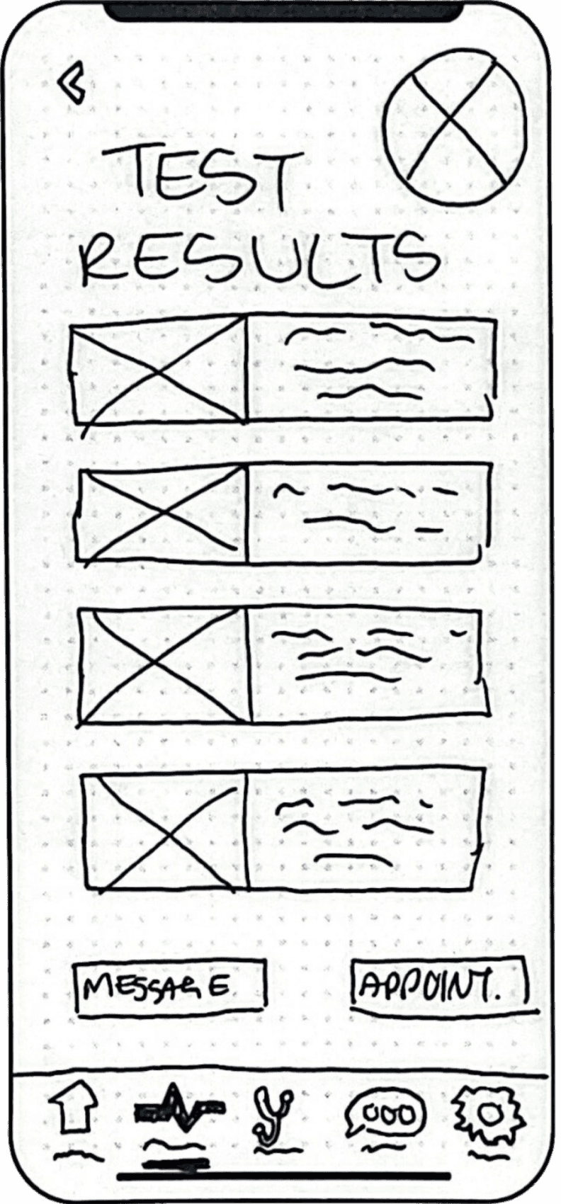
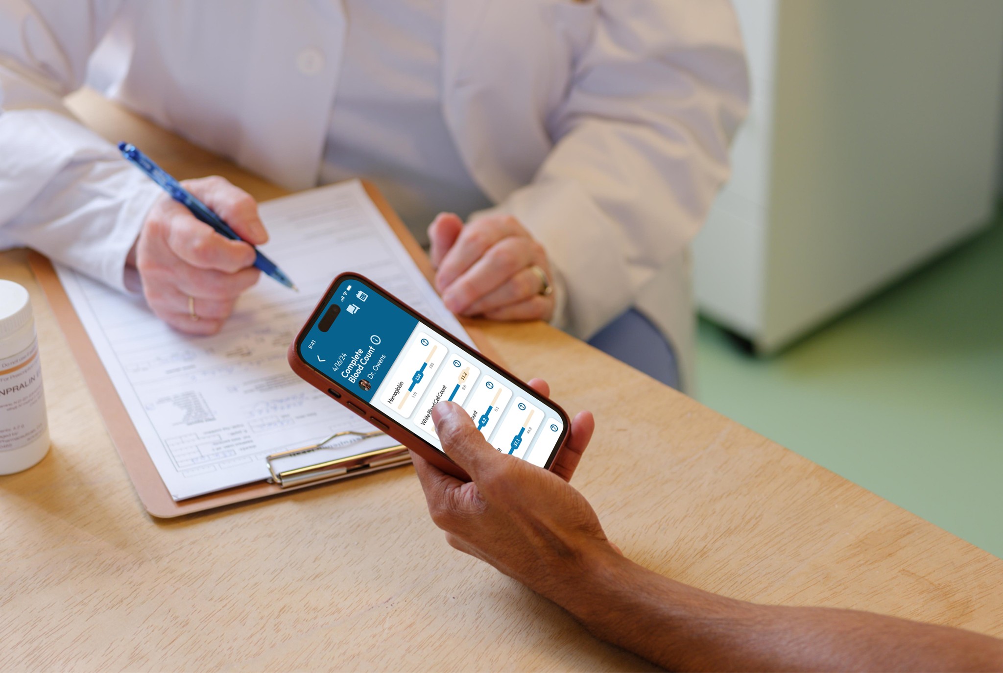
View test results
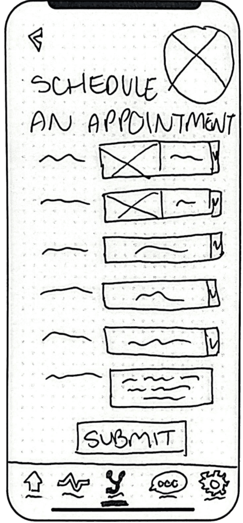
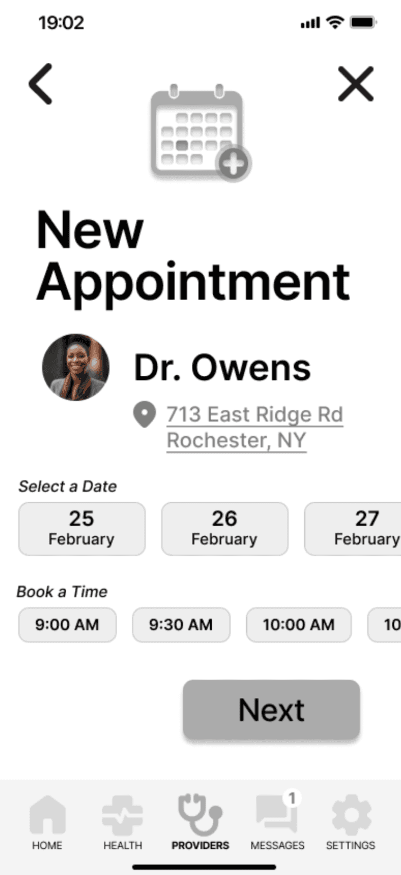
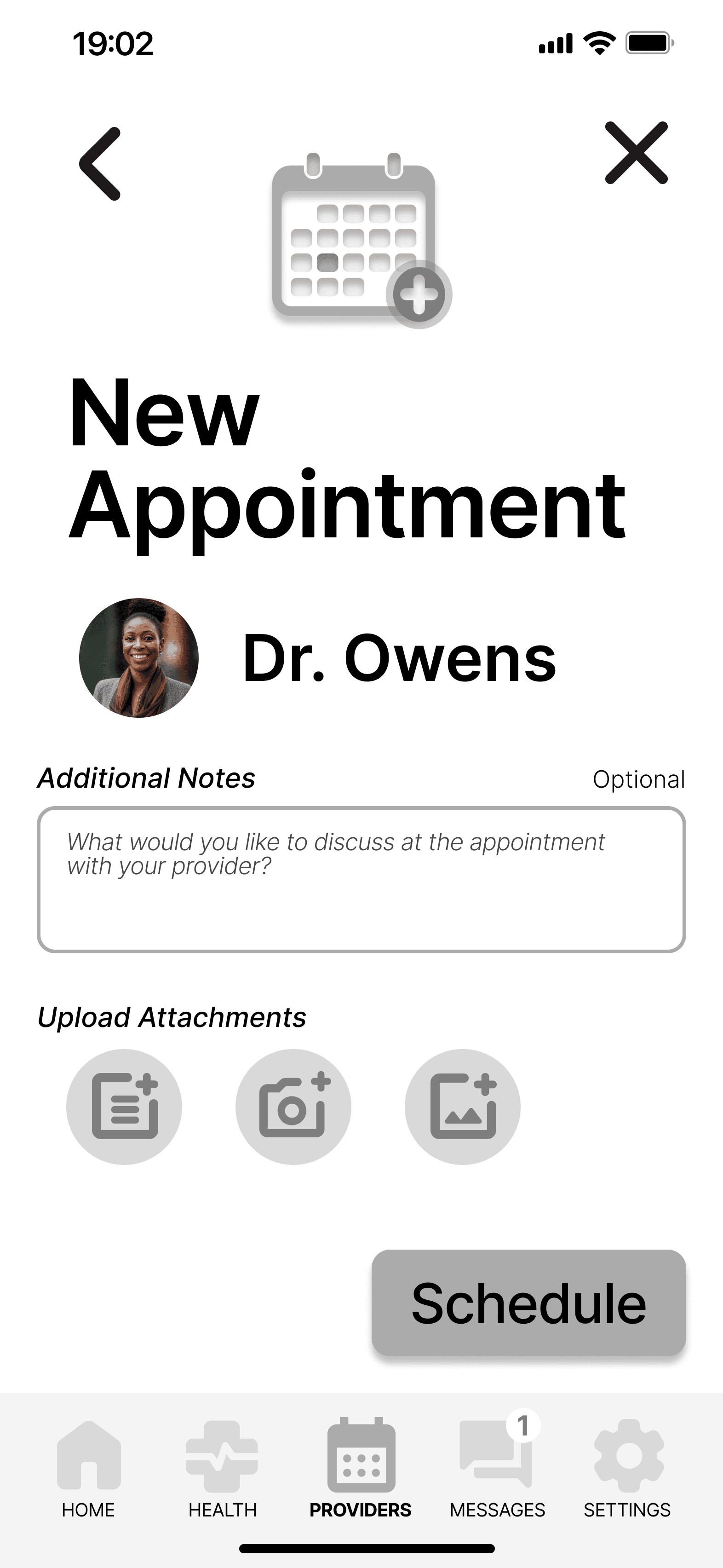
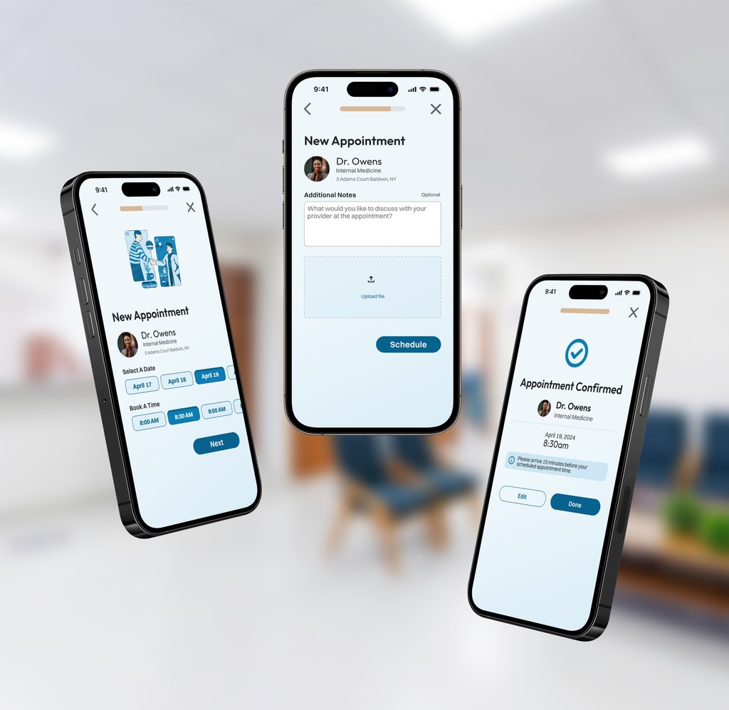
Schedule an appointment
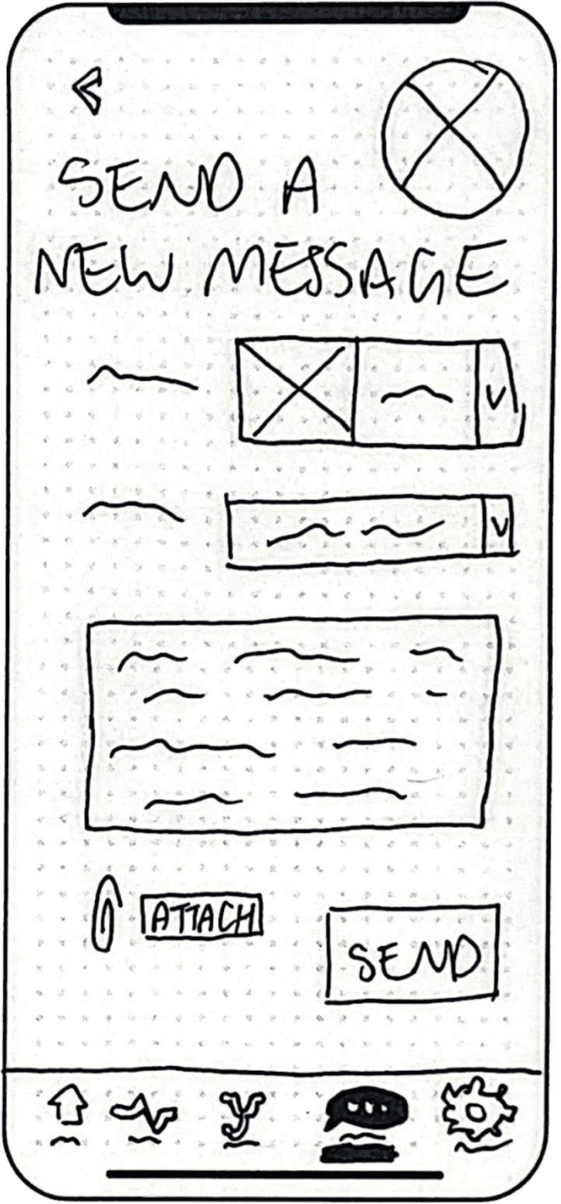
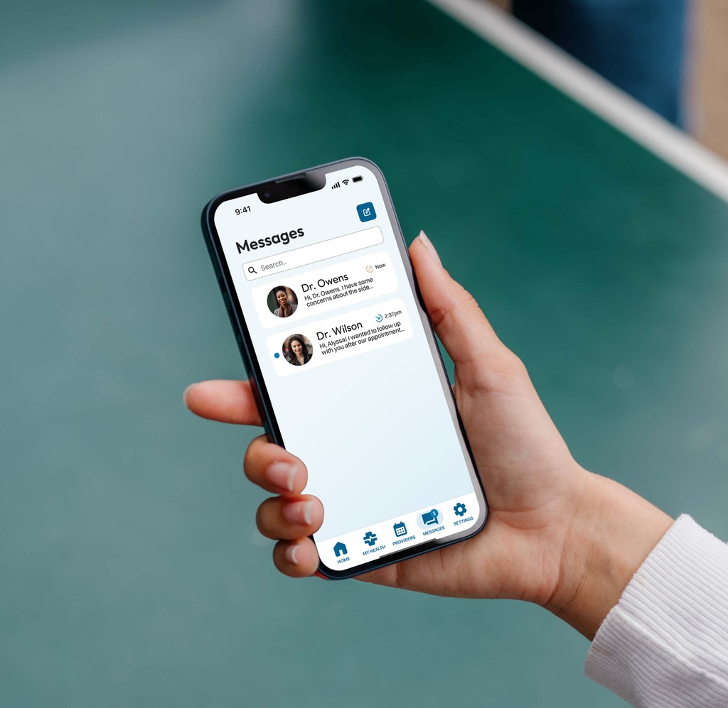
Send a message
Once core features were solidified, a series of low-fidelity wireframes were sketched out for each. The low-fidelity nature of this was particularly useful this early on in the design process as it allowed for rapid iteration at very minimal resource cost.
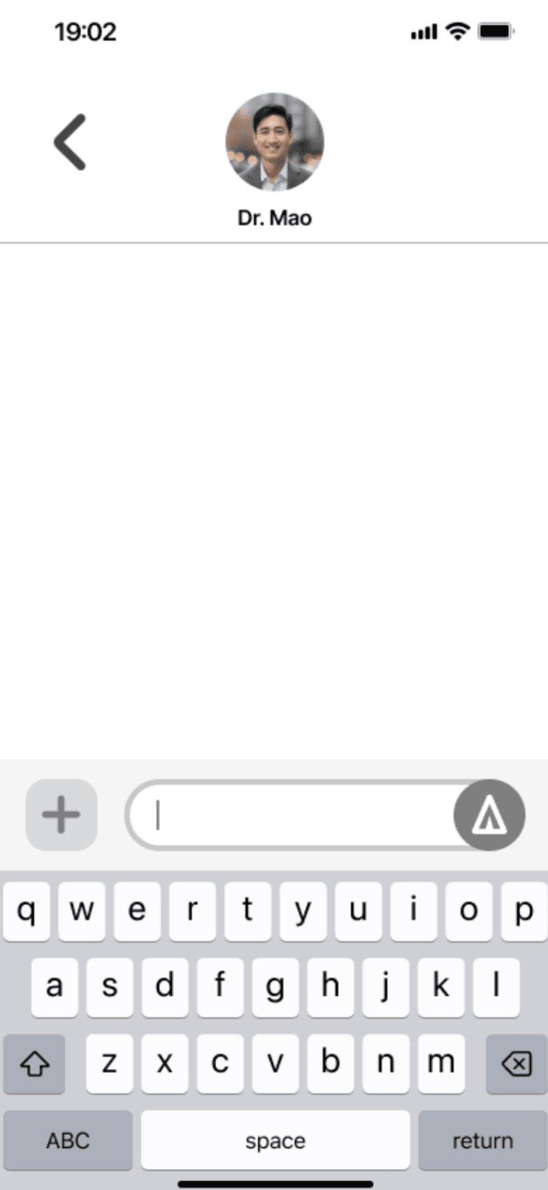
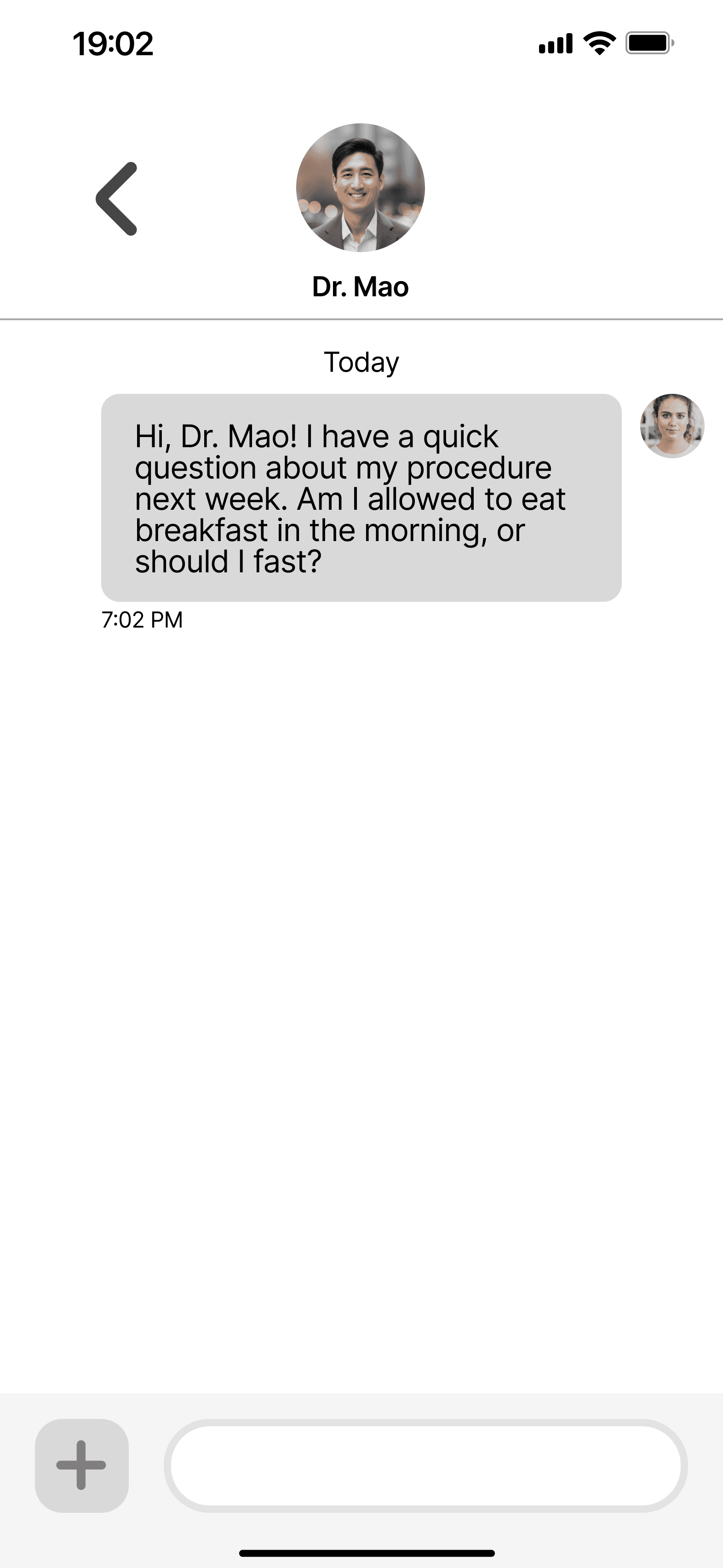
Feedback received in this design round gave rise to mid-fidelity screens that were then incorporated into a clickable prototype.
In-person moderated usability tests were conducted to determine the utility and usefulness of the mid-fidelity prototype.
Results
To assess ease of navigation and task completion for new users
Test Objectives
Are participants able to complete the account creation process with ease?
Are participants able to locate:
Their test results and understand supporting information?
The appointment scheduling tool and reserve an appointment time?
The messaging center and contact their provider?
Methodology
Usability tests were conducted with six participants, aged 18 to 79. This age range was selected for to examine how patients of varying age and familiarity with digital interfaces would interact with the portal.
Participants struggled to find the appointment scheduling tool
EVIDENCE
83% of participants navigated to several incorrect pages, verbally expressing confusion.
REVISION
The navigation bar icon was changed to a calendar to better indicate the page's contents.
Other Revisions Made
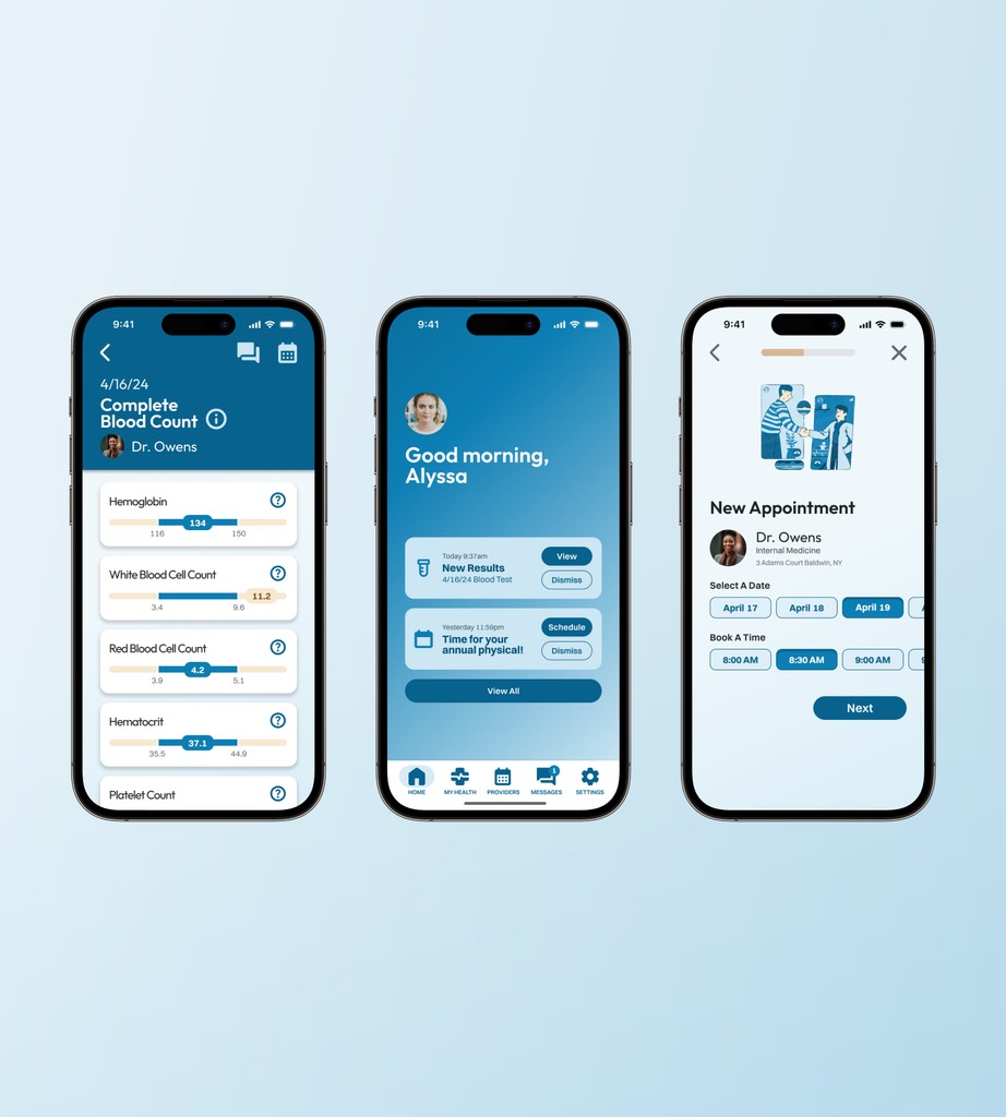
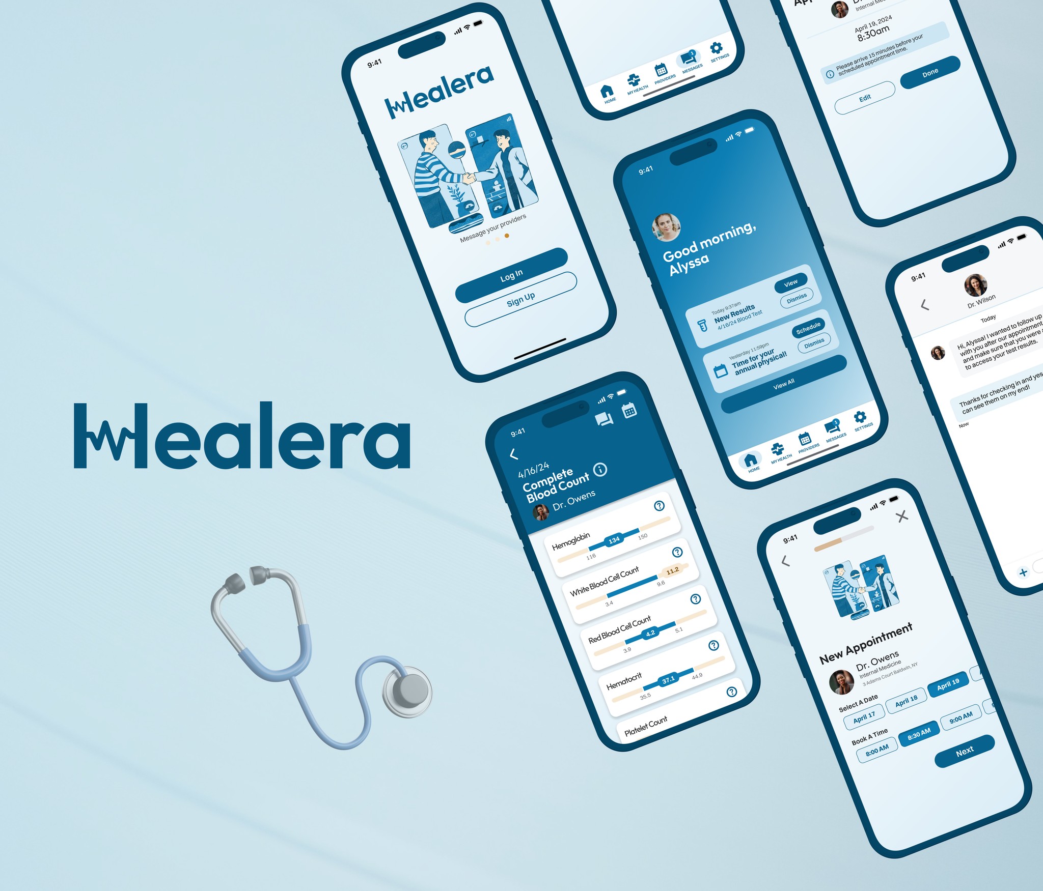
(A high-fidelity prototype developed in light of these revisions can be found below.)
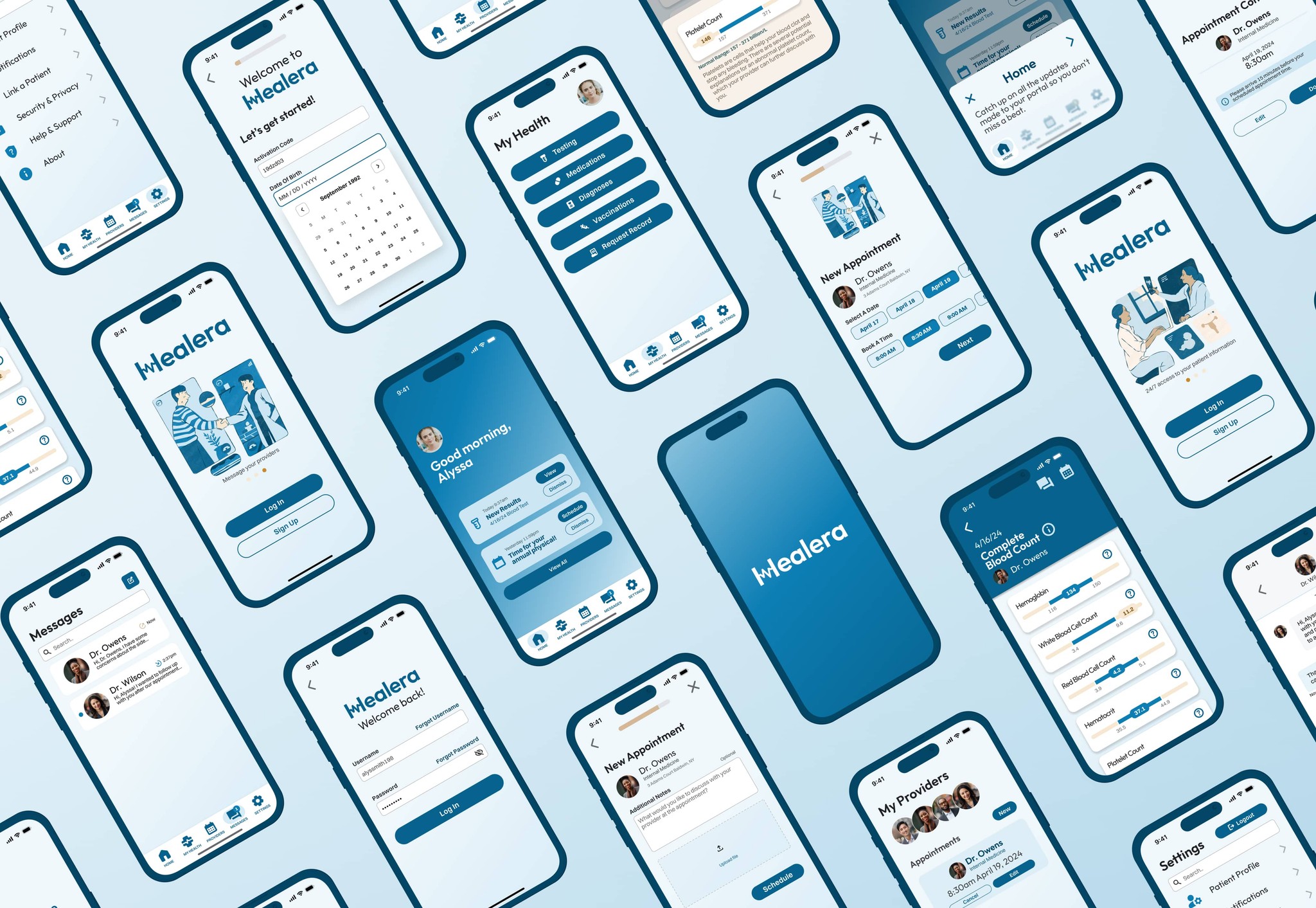
Research and testing findings demonstrated that users seek an effortless interface that welcomes them to take action throughout their health and wellness journey.
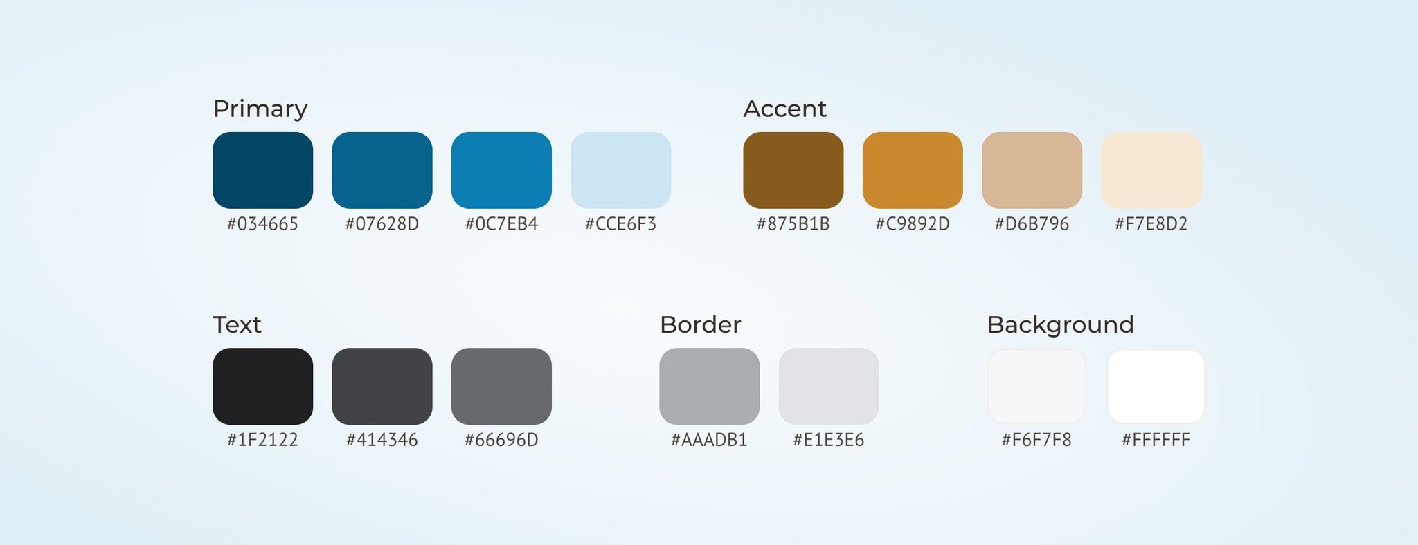
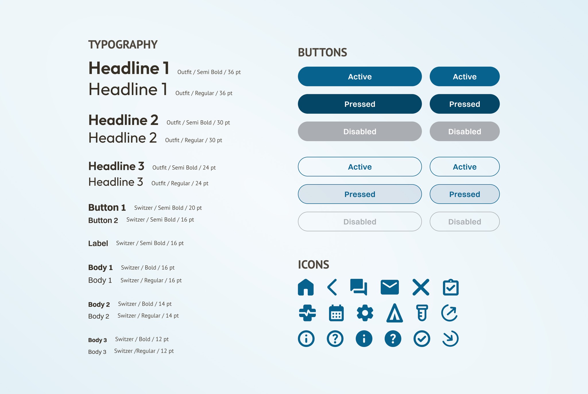
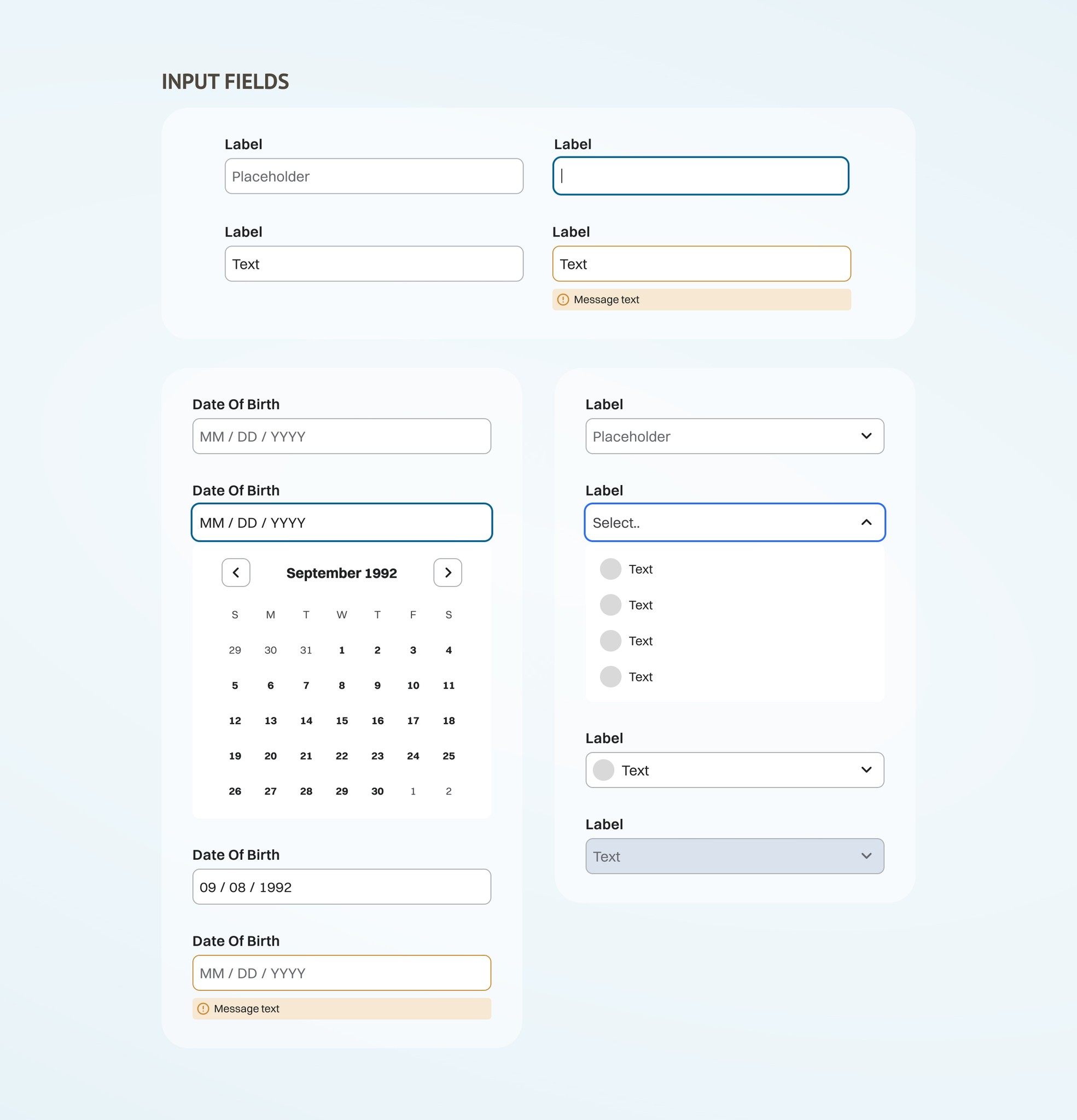
Finalized aspects of UI were compiled into a style guide to ensure consistency across the Healera platform.
As the sole designer working on the project, I was able to take on a variety of UX/UI roles and found myself greatly enjoying the evidence-based flow of the design process. There were several key lessons I garnered from my time:
When possible, take part in direct user observation while testing. Due to time and other constraints, I decided to utilize digital card sorting tools. While I was still able to draw valuable conclusions from the digital data, I will strongly consider conducting in-person card sorts in the future to get more direct answers as to the "why" behind each decision made.
No need to reinvent the wheel! Redesigning a user flow for a feature that users are otherwise familiar with is likely to generate unnecessary UX friction. Instead, utilize existing industry design patterns to reduce the cognitive load of users.
Keep all project documentation well-organized. This ensures reliable retrieval and quick reference of materials as needed, promoting well-informed design decisions.
