RESPONSIVE E-COMMERCE WEBSITE
Revitalizing online jewelry shopping with local charm
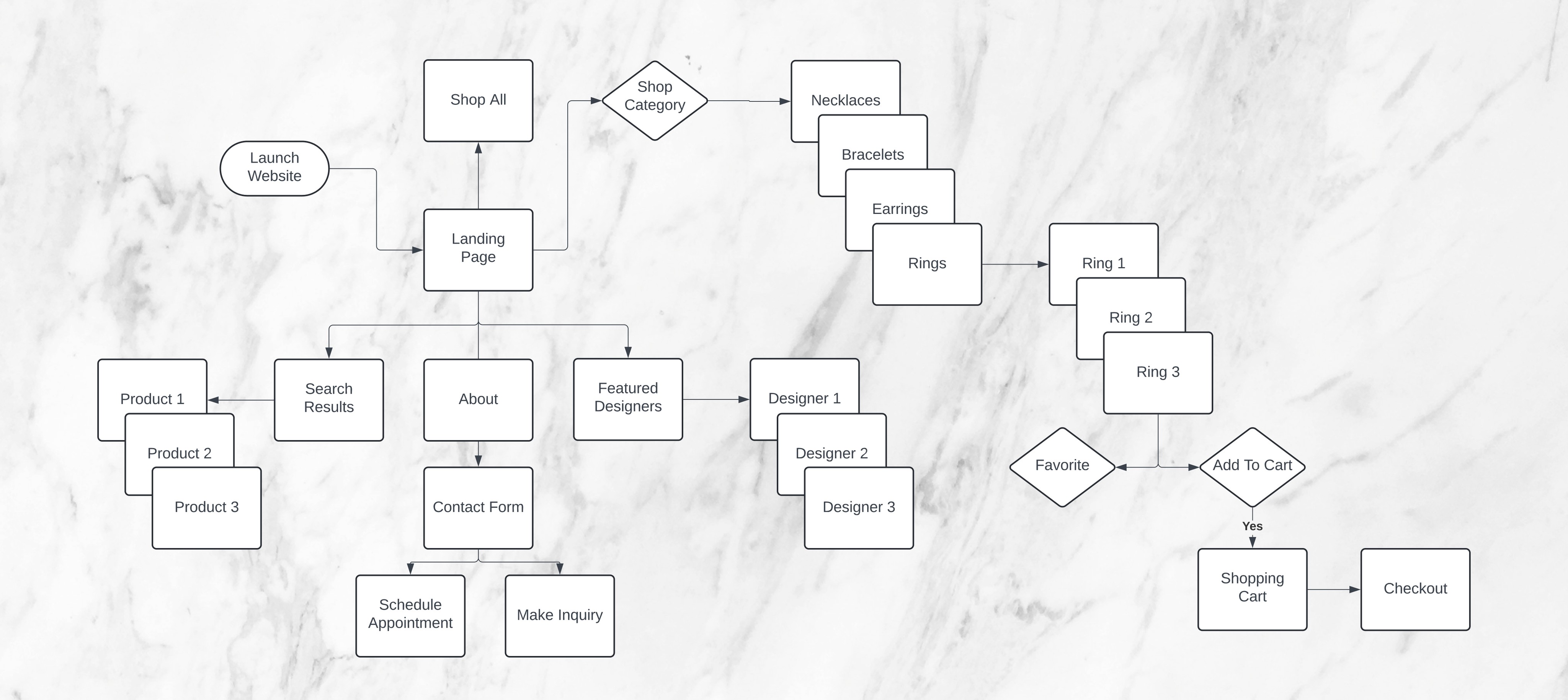
User Flows
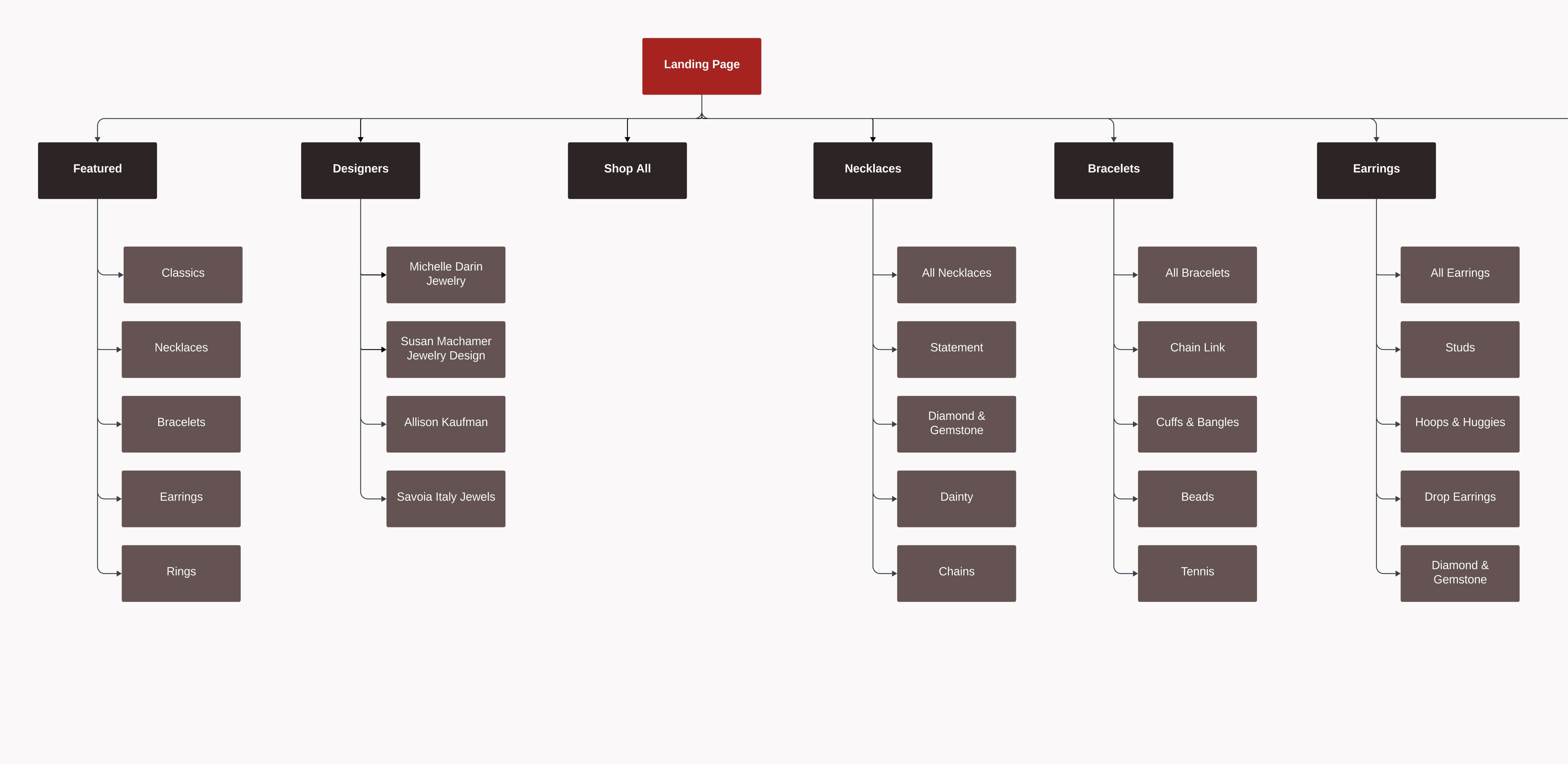
Sitemap
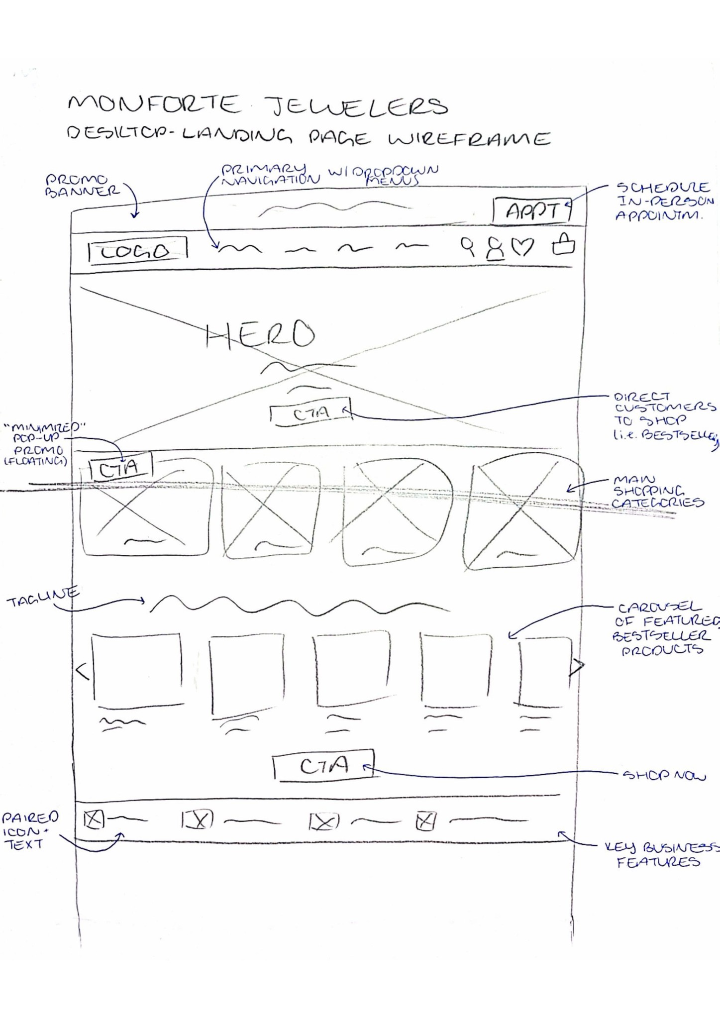
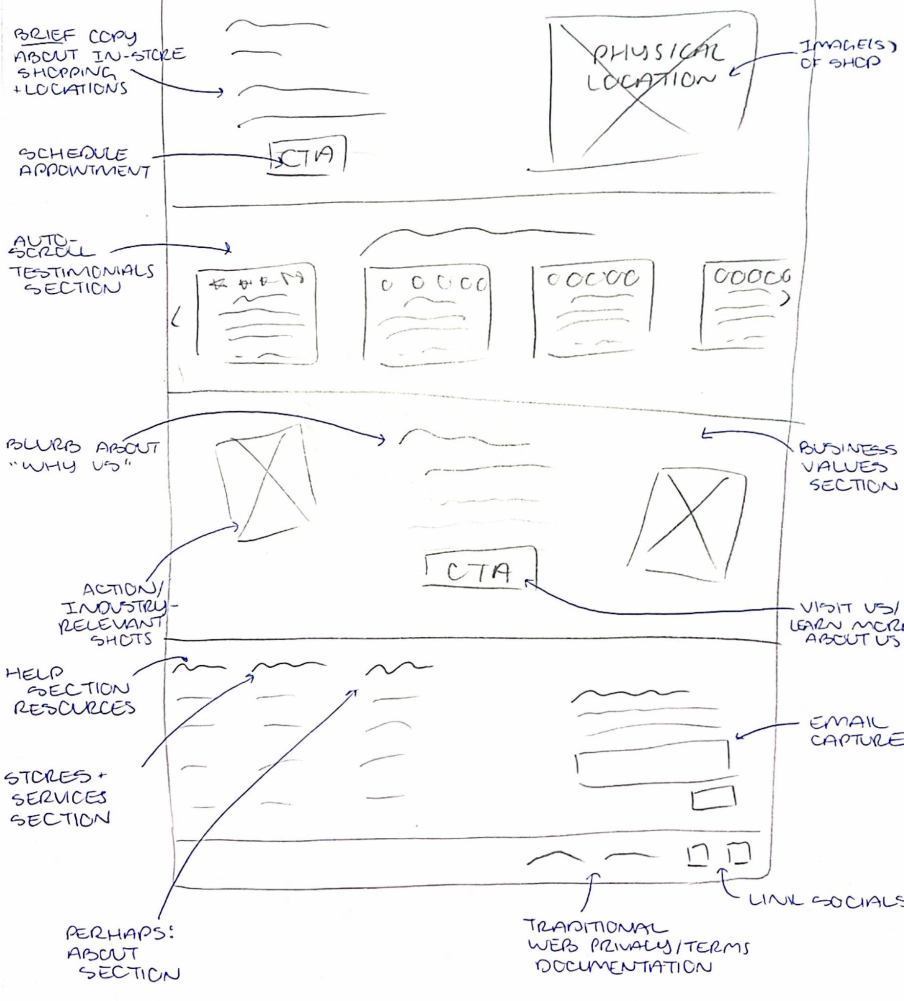
Wireframing
UI Redesign
After 30+ years of local business in the Central New York area, our client, Cazenovia Jewelry, will soon undergo a complete rebranding to Monforte Jewelers. With this change, the original webpage will be rendered obsolete, requiring a new site— in which the client wants to explore potential for expanding e-commerce revenue.
Monforte Jewelers seeks a reinvigorated online presence that allows customers to virtually browse and shop a curated product catalog, as well as learn more about retail locations and services offered.
How can we create a high-quality shopping experience while capturing the charm of a local jeweler?
Monforte Jewelers prides itself on quality service and craftsmanship— characteristics that have earned it top ratings with local clientele. As such, it is vital that the brand's refreshed website upholds established trust with prior customers and warmly embodies the experience and values of a local small business.
Initial discussions with stakeholders gave rise to a project brief compiled to organize the client's business requirements and overall design criteria. This document served as a streamlined reference point for our small team throughout the design process, ensuring that decisions made along the way aligned with client priorities.
At this point, primary user stories were crafted to clarify how the website will provide value to customers. This was an especially important aspect of the discovery phase as it helped to ensure that subsequent design decisions not only satisfied the client's wants, but also fulfilled the actual shoppers' needs.
User Stories
As a new customer, I want to learn more about the business, so that I can establish trust and better understand the services offered.
As a online shopper, I want to browse a virtual catalog, so that I can quickly get an idea of the types of pieces that are available.
As a shopper, I want to save pieces that I like, so that I can easily find them again at a later time.
As an non-local customer, I want to order jewelry online, so that I can purchase pieces I love from afar.
As a local customer, I want to review retail location information and schedule an in-store visit, so that I can experience in-person service and try the pieces on.
As a new customer, I want to learn more about partner designers, so that I have a deeper understanding of the quality craftsmanship that goes into each unique piece.
As an intrigued shopper, I want to get in touch with the business, so that I can get answers to the questions I have.
At this point in the process, it was important to begin narrowing down the client's refocused visual identity to ensure brand cohesiveness in the final product.
As previously mentioned, the client will be rebranding from Cazenovia Jewelry to Monforte Jewelers in the near future and seeks a new website to reflect this identity shift— which is where I come in.
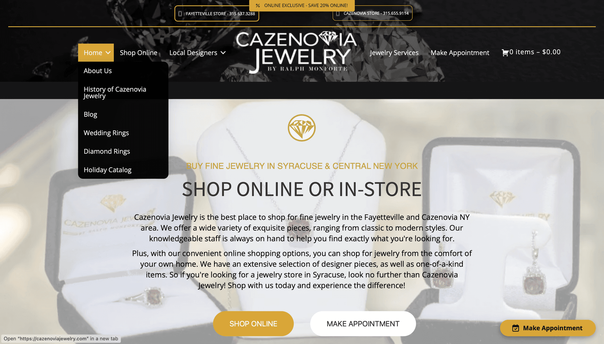
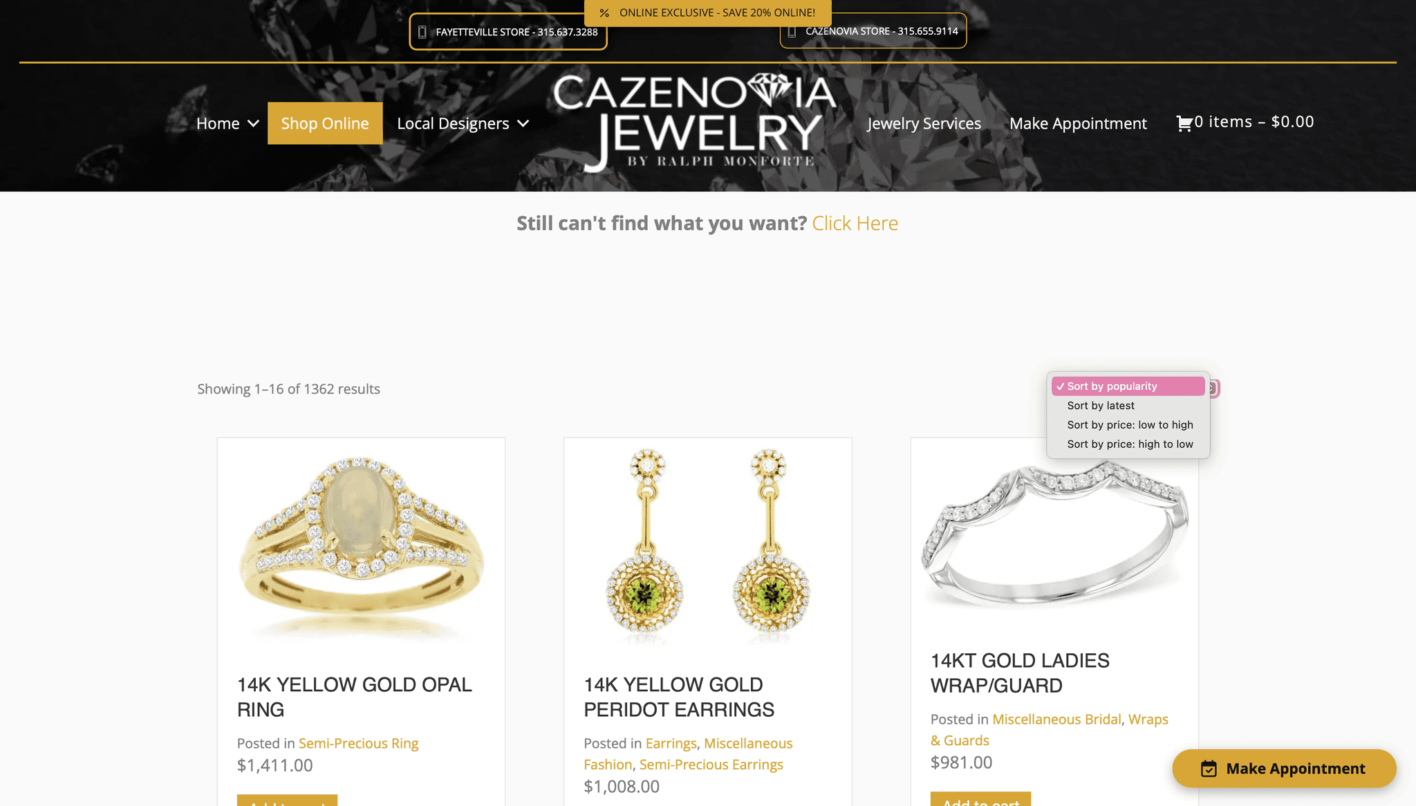
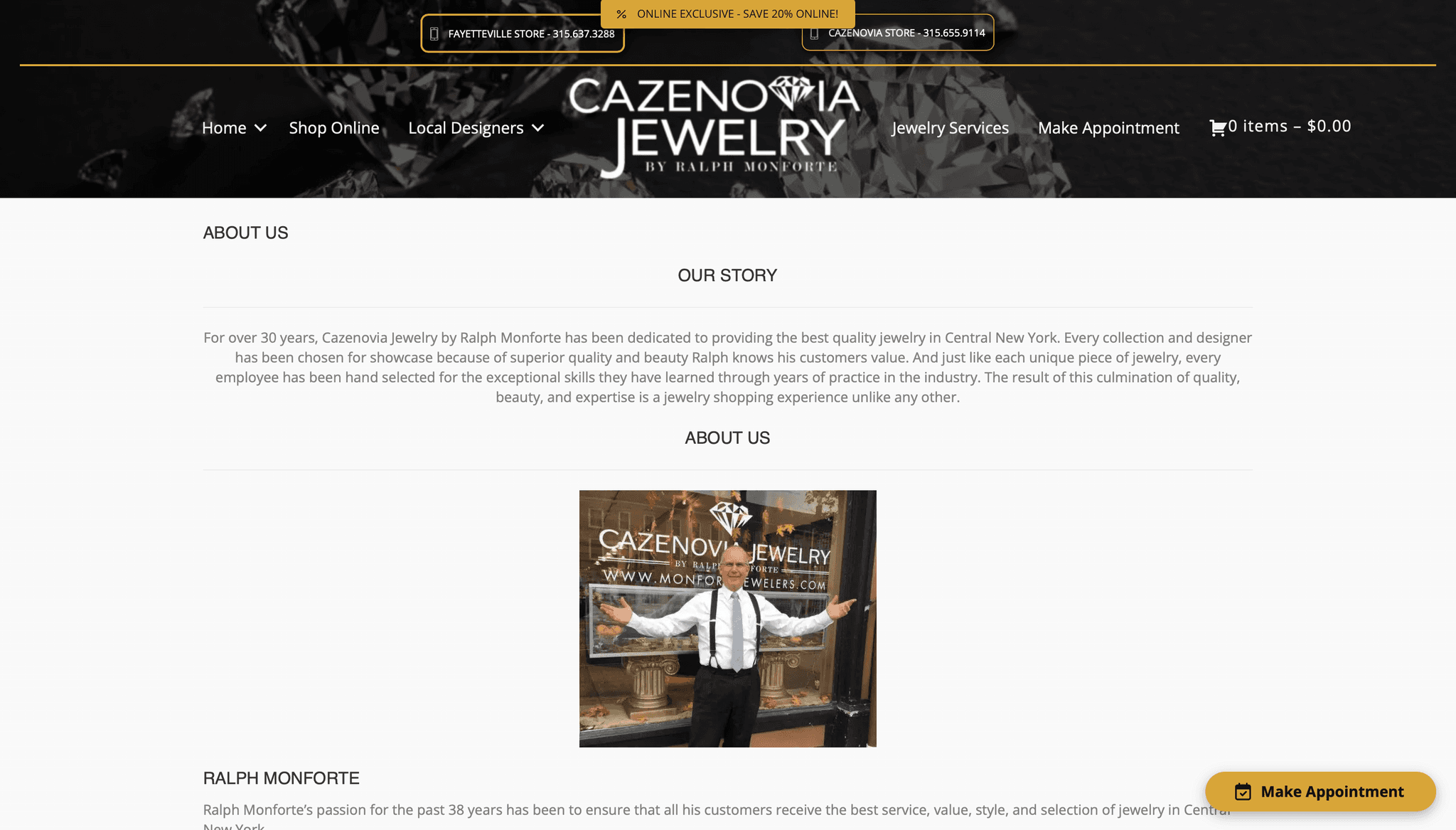
To provide some context, the screenshots below capture the old UI of the Cazenovia Jewelry website:
Figure 1. Dropdown navigation is bland with no interest-capturing images, and there is no search bar available.
Figure 2. Collection page lacks a filter tool; excess copy takes away from the actual products.
Figure 3. About page is text-heavy and does not adequately describe what Monforte Jewelers can do for customers.
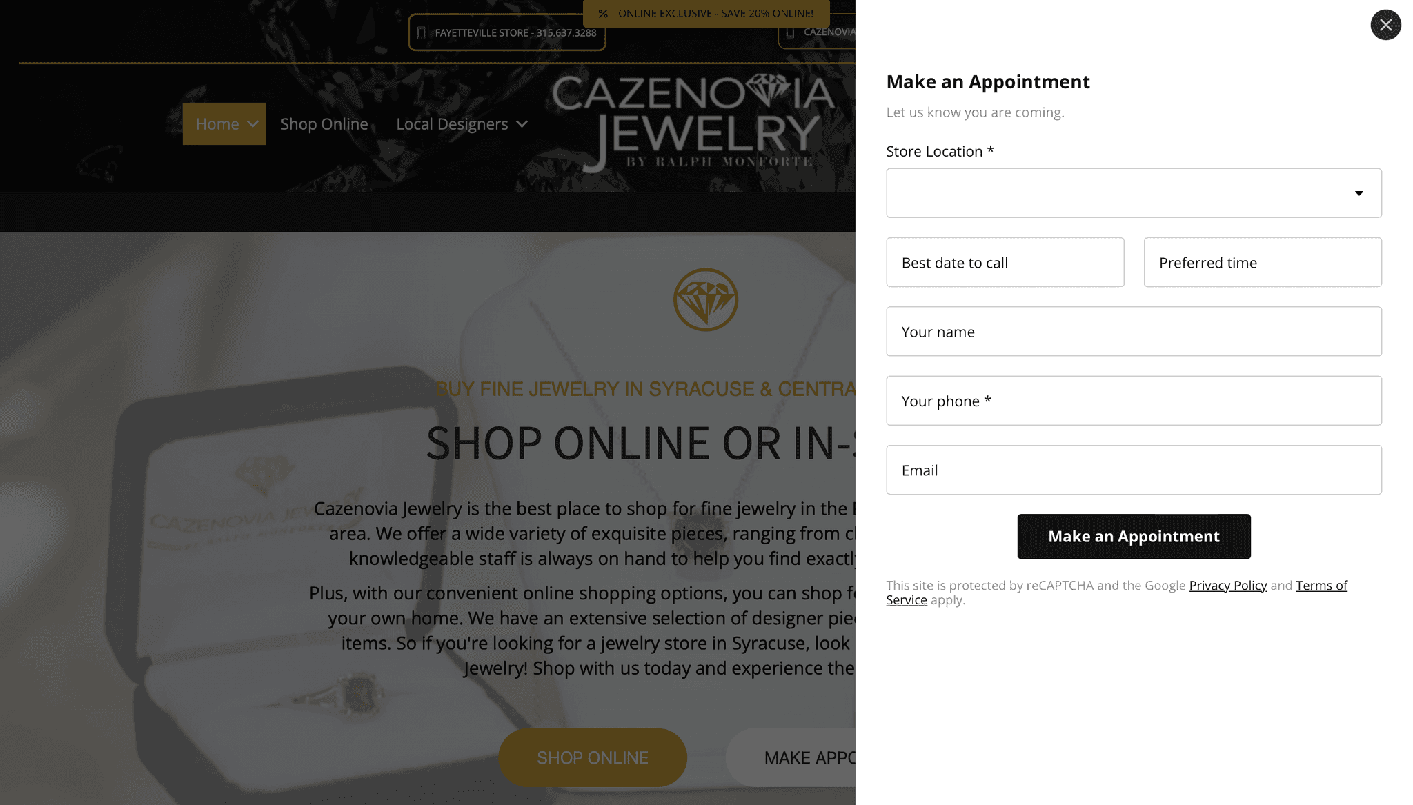
Figure 4. Appointment contact form does not account for other reasons users might want to connect.
This website, while comprehensive, features too much copy— weighing down the overall UX, a color palette that does not match the desired mood, and clunky navigation offerings.
Review the old vs. new UI for some of the new core features, or the explore the live site.
EXPLORE FEATURED DESIGNERS
Discover the unique craftsmanship of each designer and shop their collections.
FILTER CURATED COLLECTIONS
Find just the piece you're looking for— within budget!
build trust
Learn how Monforte Jewelers has served the community and what they can do for you.
dynamic contact form
Simply pick your goal and fill out the form to get connected!
As my first project with a client comes to an end, I feel an immense amount of appreciation for the opportunity to learn by doing. It was such a thrill to apply my curiosity to a real-world project, through which I gained much insight.
Don't be held back by the unknown— you'll learn as you go. This project happened to be my first time working with Wix Studios. The software was fairly intuitive, but some features that I am very comfortable with in Figma and Framer were simply not available, or they just did not work the same. To be successful in this role, I had to simply dive in and learn to problem-solve as curiosity or challenges arose.
Balancing client and user interests is an art. Throughout the entire project, I had to tackle the challenge of balancing business requirements with user needs. The client is paying for the work, but at the end of the day, if users aren't happy with the site, then all is for nothing. This is where the project brief came in handy— any time I was debating which direction to go, it was a fantastic resource to review the wants and needs of both parties.
I am excited to take these lessons on how to better fulfill stakeholder and UX needs into my future work!
